
client: City of beaverton, oregon
Beaverton Restaurant Week
The City of Beaverton wanted us to create a fun look for the event and promotional campaign that would meet the existing city branding standards. While owning a small town vibe, Beaverton wanted to emphasize their claim as the restaurant destination for the west side. They wanted to challenge the perception that Beaverton is all chain stores and strip malls. Dining in Beaverton is “the real deal.”
We presented the client with three different design concepts for Beaverton Restaurant Week: safe and conservative, a bit more adventurous, and one outside their comfort zone. We refined the concepts and ended up with a nice balance of contemporary and hip, but also comfortable and welcoming to all.
PROJECT DELIVERABLES
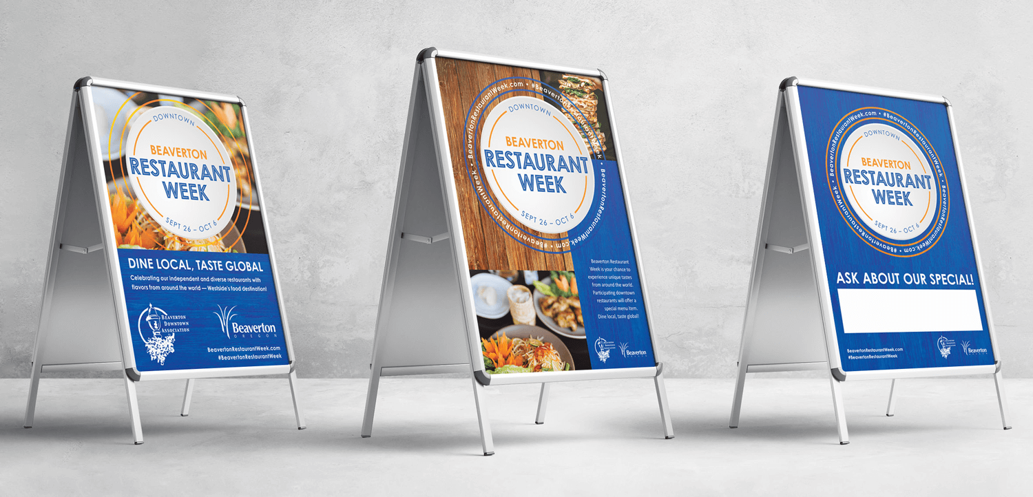
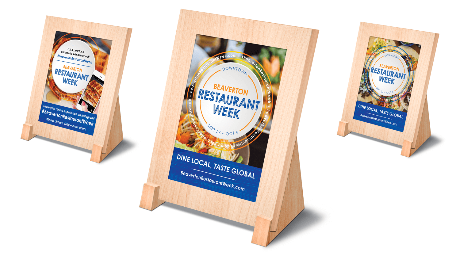
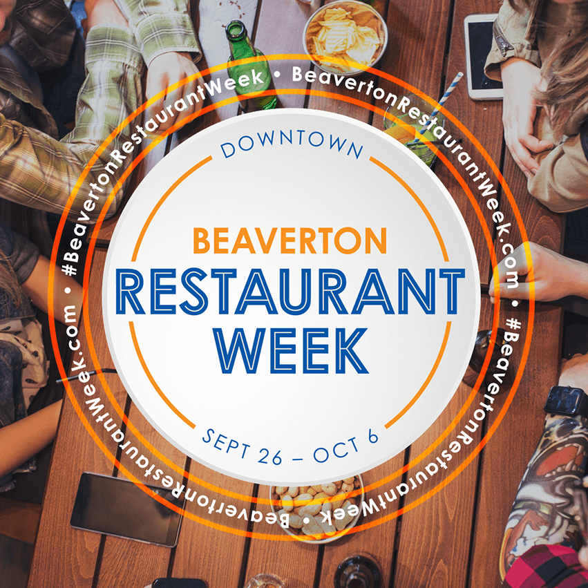
EVENT LOGO // BRANDING // PRINT COLLATERAL // SOCIAL MEDIA ASSETS

DINING ON THE WEST SIDE
The Results
The event continues to grow each year with over 40 unique, locally owned downtown Beaverton restaurants participating in the annual event. Promotional collateral includes light pole banners, posters and flyers, advertisements, social media assets and more.
Iron Canvas Studios has had the pleasure of working on the event branding for Beaverton Restaurant Week for the last three years. The first year of the event was a great success, so much so that the same design was used the following year. For 2019, Beaverton wanted to put a fresh spin on the existing look of the campaign but have it remain recognizable at the same time. Mission accomplished!
