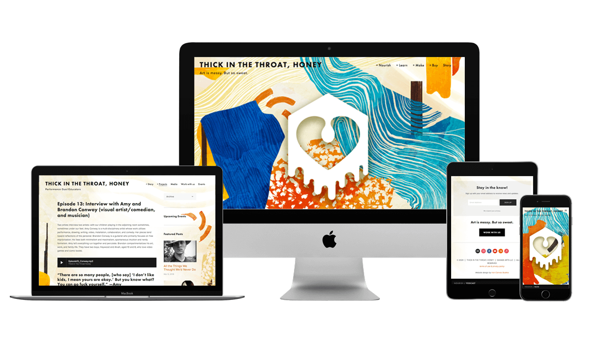
client: thick in the throat, honey
Art is Messy but Sweet
Thick in the Throat, Honey is a Portland, OR-based performance duo morphing jazz, spoken word and experimental music. In addition to the performance side, they wanted to expand their focus to helping other parent-artists nurture their creativity, teach music and writing courses, and start an discussion-style podcast. The business is geared towards clients who have kids or crazy jobs and are desperate to do something that feeds them — invigorates vs. enervates.
For the logo and overall brand direction, TITTH liked the inspiration of the Pacific Northwest outdoors — forests, oceans, wet and wild. The name is both literal (the colors of honey) and suggestive (things that drip slowly and are sweet, or stuff that gets stuck in your throat that is emotional).
PROJECT DELIVERABLES
LOGO // BRANDING // WEBSITE // PODCAST SETUP
Parents can be artists, too
The Results
After wrapping our heads around the vast range of services offered by Thick in the Throat, Honey (performers, artists, teachers, podcast hosts), we knew we wanted to create a brand that matched both literally and metaphorically. Working on this project also introduced us the the world of podcasts and navigating the setup. Fun stuff!
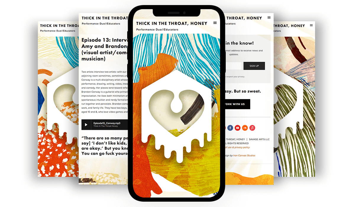
The logo mark represents the love of art, the drippiness of honey, and an open mouth/throat expressing oneself. The artwork is organized chaos… much like life. Interesting, pleasing and eye-catching. When paired together, the brand took shape. Since both elements are graphically powerful, we went with clean and simple typography.


